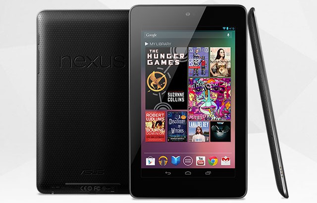
My company recently acquired a Google Nexus 7 tablet for web application testing, and it occurred to me that this device would be an exceptional way to feel my way around the Android OS which I have never used before. This small, 7″ tablet came running Android 4.1 Jelly Bean, which is the latest version and is highly regarded as the most refined Android experience ever. What better way to get my feet wet, especially in light of all my waffling last week on the subject of mobile phones.
Rather than the full-size 10″ tablet market that the iPad cornered, the Nexus 7 is clearly designed to target the small, low-end tablet market in which the Kindle Fire has enjoyed much of its success. Once you sign in with a Google Account, the tablet’s home screen comes alive with a variety of widgets that are clearly designed to make the UI friendly to someone who would use the device for reading magazines and books, surfing the web and watching video. And it’s a really sharp and vibrant display too, with bright colors and rich blacks.
Navigating around was disorienting at first. On my familiar iOS devices I’ve got loads of icons for apps, which are really gateways to the real usefulness of iOS. On Android your apps live in one space, and your home screens can be used for just about whatever you’d like, particularly widgets. There are gadgets that can display a Twitter feed, headlines, weather or whatever else. It’s cool that you can get information like this at a glance on Android, whereas in iOS you’d have to open the respective apps one at a time.
Coming from iOS, I was also a bit disoriented by the concept of true multitasking. Which is funny when I think about it, because I’m an extreme multitasker on my Windows workstations. Three monitors, tons of programs running, video encoding over there while I’m coding over here and email is being kept up-to-date behind it all. And yet on the Nexus 7 I felt wowed by this. I haven’t yet used it for anything that iOS’s hybrid “app backgrounding” system couldn’t accomplish, but I can certainly see the potential. Downside: Needing to remember that stuff is still running and clear it off your task manager if you want it to stop using resources, though I get the feeling this shouldn’t be necessary except in the most dire circumstances.
Physically, the 7″ form factor of the Nexus 7 is great for personal reading, movie-watching and game playing in bed or while traveling. It’s also a lightweight device that isn’t going to exhaust your arms, and yet doesn’t feel frighteningly cheap like the Samsung Galaxy S-III kinda does. And it’s sure hard to beat that $199 price tag (or $249 if you want 16 GB of storage instead of 8 GB). Expandable storage via MicroSD is really the only glaring omission; none of Google’s Nexus devices seem to have this for some reason.
The “app experience” is still the unknown quantity for me, as I haven’t really experimented with any. In the past, when I’ve gone spelunking in the Google Play store to see if I could find equivalents for my favorite iOS apps, I came up a bit short in some areas. Mainstays like Dropbox and Skype are of course present, as are apps for PayPal and most major banks. Less available (when compared to iOS) are games, though again, the big names are represented. I also see no analog for certain little things that I’m used to on iOS, like the ability to invert the colors of the entire screen. (Great for night reading.)
One thing I had to check right away was how the Nexus 7 handles Word documents, as I do a lot of Word doc reading on my iOS devices. The default Android document viewer was kind of a mixed bag. It did some things better than iOS, including nicely-rendered page breaks (on iOS you have no idea where they are), and unlike iOS it can also render inline images in documents. But far more glaring to me as a writer was the outright omission of first-line indents and the loss of font family, background color and border information. I suppose there are third-party document reader engines available on Google Play that I could look for, just as there are basic things like third-party keyboards — another foreign concept for an iOS user!
I am now much more interested than before to see what Apple’s supposed “iPad Mini” is going to look like; I suspect we’ll find out within the next 4-6 weeks if the rumors hold true. Although I really like this little Nexus 7 and am going to continue to learn its ins and outs, my family is already fairly familiar with (and tied to, to be honest) the iOS ecosystem. Having gotten a taste of the 7″ form factor and finding that I really like it, it would be excellent to have an iPad in this size while still retaining a 1024×768 resolution or thereabouts. The added bonus of iCloud integration and shared apps would make it an easy win not just for me, but for my wife as well.
If you’re already ensconced in the Android ecosystem, though, and are looking for a 7″ tablet, I would not hesitate to recommend the Nexus 7. I’d just suggest that you get the 16 GB version since storage is not expandable.


