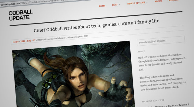
Little more than 24 hours after initially expressing my dissatisfaction with the direction this blog’s design had taken it, I completely gut the whole thing and slap a new design on it. As I’ve grown accustomed to saying lately, “I’m probably crazy.” At the very least, the late hour until which I’ve sat up tonight is certainly pretty crazy. But creative energies rarely choose the most opportune times to strike. Although I know I’ll be paying for this tomorrow with a cascade of insuppressible yawns, it will all be worth it.
So, welcome in: you’re looking at the eleventh revision of the Oddball Update, this time featuring a bit of a return to its text-centric roots. The rigid layout of Oddball X has been supplanted by the flexible and responsive design of Oddball XI, which should not only scale nicely to fit your smartphone or tablet screen in any orientation, but also allow me more freedom to post entries with or without a bevy of images and media to back them up.
Featured posts get special callouts on the main index with larger images and a two-column byline/excerpt style, tags make their return to the fore, my latest tweets get upgraded to the sidebar, and lots more besides. It’s not really a functionality change vs. what Oddball Update was before, but it’s certainly a stylistic change, and for the better if you ask me.
Some issues remain, of course; mostly minor ones at this point, but things I intend to tweak and patch here and there as I embark upon my latest and greatest attempt to actually post something here every day. I also have a couple of upgrades in mind, including switching out the tagline at the top of each page for a slowly rotating series of excerpts or quotes from recent entries, designed to give you a taste of posts you may not have read. The next/previous post navigation at the bottom of each page also needs assistance, and I’ve already got a great idea for dressing that up.
The brunt of the credit for this new design goes to DevPress and their free WordPress theme “Origin”. I’ve made a few tweaks to it here and there; nothing major as yet, but with more adjustments to come.
With today’s site-centric post out of the way, now we can start talking about some real meat and potatoes: video games, family life, cars, gadgetry, random wackiness, movies and hell knows what else.
But first, I need to (in the immortal voice of Samuel L. Jackson) go the fuck to sleep.


Well, I like this – it’s very “current” and clean while still giving you plenty of room for all the content without looking cluttered 🙂
Yes, that was my thought as well. I like the use of negative space. Also, it’s really cool when you can take the edge of your browser window and drag to make it smaller, and you see all of the content scaling down to fit nicely to the resulting size. Looks great on the iPhone and iPad. My last theme was horrendous on there.